
10 Tips for Better Photos of Your Children- Must Read
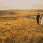
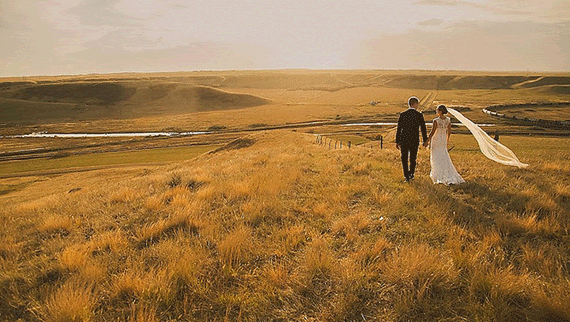
Professional photography is a fantastic way to celebrate important moments in your life. It also allows all of the family members to be in the image as well. Finally, it creates true custom works of art. However, those images will account for a tiny fraction of the photographs that will take place in your life.

The majority of images are the everyday photographs families make themselves to capture moments and save them for the future. These are the images that tell the story of our lives. Here are some tips to quickly improve the images you take every day. Have fun experimenting with them and try a few of them each time you are out.
1 – Know Your Camera
One of the most common questions I get is “What camera should I buy for myself?” while the answer sometimes changes for specific situations, the best answer I can have is: “The one you will always have with you.” The moments we want to capture and save for ever are often not planned. They are spur of the moment and usually are fleeting; they disappear as quickly as they appear. Having a great camera that is too bulky for everyday use means it will be sitting at home when the action is taking place right now. Most of us have a very good camera built into our newest smartphones. The best thing you can do is learn how to use the camera you have right now. Learn how to turn it on and keep it a mode that is the best for spur of the moment shooting. Learn what the buttons do and why you would choose one mode over another. If reading the manual and practicing isn’t your style, invest a little bit of money in a video or attend a local photography workshop.
The goal is to become like a quick draw artist from the old west. Be able to get your camera out, into a shooting mode and ready to start firing images in just a few seconds. It only takes a little familiarity and a little practice with your camera to be able to do this. That way, when Johnny starts to pull a face at the clown on the street, or Jenny climbs into the flower bed, you can freeze that priceless moment and add it to the storybook.
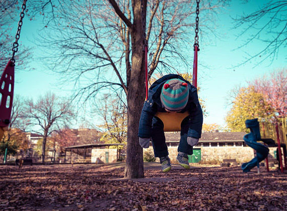
2 – Get Down to Their Level
Adults see children from the same angle. We are looking down at them all the time. If you want to quickly change the impact of an image of child, get down low to their level. This accomplishes a few things. First, it allows us to see the world from their perspective. We get a new angle on the world and that is refreshing. Secondly, it puts them visually on the same level as our world, and that raises the impact of the image. Also, psychologically, it changes how they feel about the moment. When we get down on their level, they feel more equal, and that makes them feel happy. It can actually improve their expression in the image.
3 – Get Much Closer
A famous photographer, Robert Capa, once said, “If your images aren’t good enough, you aren’t close enough.” This is something you can prove to yourself with just a little experimentation. When we take a posed image of people, we tend to capture a lot of the image around the person. Next time you have the opportunity, take the picture you were going to take, but then start to move in (either with your feet or with zoom if you have it) and gradually get closer and closer, taking an image each time you get closer. Go until you think you are too close, and then keep going!

You’ll be surprised with how much character you can get in an image when you combine number 2 above, getting down to their level, with getting very close. Try getting so tight that you are cutting a bit of the head at the top and don’t have much below the chin at the bottom. You’ll be surprised with how nice those images look. Combine that with number 4 below, new composition, and you will be entering a whole new world of amazing images.
4 – Try New Compositions
One of the things we most often do is place the person or the person’s face dead center of the frame. This is called a bullseye composition. Another way to increase the quality of your images is to move off the bullseye. One concept photographers are taught regarding composition is called the rule of thirds. We divide our viewfinder into thirds, both horizontally and vertically. This creates a small grid with 4 points where the thirds interact with each other. If we place our subjects, or important parts of the subject such as the eyes, on these intersecting points, we get a stronger impact from our images. Many cameras have an option to turn on a grid in the viewfinder. This grid is usually the rule of thirds so it makes it very easy for you to change your composition while looking through the viewfinder. One tip, if you do use the rule of thirds for your composition with people, make sure people are looking towards the center of the image, and not off the edge.
5 – Be Very Patient
Being a professional photographer working with children, one of the first lessons we learn is that children are going to do what they are going to do. If we try and make them do otherwise, they react very strongly! If you are after a specific image, and a child is involved, you just have to be patient. If you force them to make the image when they are not ready, they will get upset. Even if they don’t cry or throw a tantrum, their unhappiness will be visible in the image and the results will not be what you were after. That only gives us a few other choices. We can find ways to encourage them to participate on their terms. We can get them excited about the image we are about to make or, if it is a really important image for you to capture, you can provide a reward for them doing what you would like them to do. The last thing we can do is wait until they are ready. No matter what, rushing or forcing them will give substandard results. If the particular image is not critical, then see our next tip about candids.
6 – Take Candid Images
The opposite of posed photographs are candid images. The goal with candid photographs is to capture our children doing exactly what they do, the way they do it. In a candid, the viewer of the image becomes an observer of a particular moment.
These actually are the best images for telling a story of our life. Posed images that show a location help to tell where were at a particular moment. Candid images show life as it is happening. We can have an image of Johnny sitting on the wall around the playground and get a sense of where Johnny was that day. But we don’t know what he did while he was at the playground, or whether he was enjoying it. Instead, if we have pictures of Johnny coming down the slide with his arms up in the air and a giant smile on, then we know where he was, what he was doing and that he was having a great time doing it. That image captures the full moment to look back on, and why it was a good moment. Follow your children around with camera in hand doing what they like to do, and you will not just capture a moment in time, but you will capture the joy and happiness that made that moment really special for both your child and you. Then when you look back at those images, you will be filled with the warmth of happy memories because you can feel that moment as an emotion, rather than a memory.
7 – Tell a Story
A great next step to taking a candid moment is to take a series of candid moments that tell a story of the event. Next time you take them for ice cream, have the camera in hand. Take a picture of Jenny getting here cone from the man behind the counter. Then another as she proudly shows you her cone held high like the Statue of Liberty holding up her torch. A few images of the joy they have while eating the cones. Another of the aftermath with faces all covered in ice cream and a few sprinkles. Now you have a series of images that tell a whole story. When you go back looking through your photo albums, you can experience the memory again as it unfolded. You can laugh at the smeared faces, or sniffle at the pout after the ice cream hit the floor. The stories are worth saving too.
8 – Show the Environment
Earlier, we talked about getting closer for strong impact, but don’t forget to vary things up in your albums. Take a few images that include the environment. This can be done either with posed or with candid images. Using the rule of thirds from before, if we place the subject on one of the lines, we still have almost two-thirds of environment that we can show. This can be a great part of creating your story telling series of images. In our ice cream visit from before, we can include the interior of the shop in some of the images to help show the environment that the story took place in.
9 – Capture the Memories
Professional photographers are there to celebrate the family milestones from an artistic perspective, and to show the growth of a family throughout its history. From engagement and wedding, to maternity and newborn, from 1st birthday to senior portraits, we are there to celebrate your milestones. You should focus on the memories. Linda McCartney said it best: “If you see something that moves you, and then snap it, you keep a moment.” If something makes you laugh, take a picture. If it makes you proud of your child, take a picture. Even when it makes you sad, take a picture. What you are really trying to do is capture the emotion of the moment. Then you can relive the whole moment again and again. If it moves you, capture it forever.

10 – Learn more about Photography
Learning more about photography can open a whole new world of possibilities up for you. Once you begin to understand the fundamentals of photography, you will find that you can use most of them to your advantage using any type of camera. By learning more about photography we can know how to blur out the backgrounds, or know how to freeze our children as they race around (or allow some motion blur for effect!). The more we know, the more we can do in general, and the more control we have over the finished image. Just like learning how your camera works, there are lots of ways to learn more about photography. You can get books from the library or the bookstore, learn about them online, attend a course or a local workshop, watch a video and so much more.
About the Author:
Matthew Davies is a professional portrait photographer based in Boulder, CO and runs Davies Creative Photography – a boutique portrait studio specializing in child and family photography. In addition, he teaches a series of affordable workshops on photography for all skill levels. He also has a special program for mothers about how to take better pictures of their children and is available to present at mommy groups in the area.