
Health Benefits of Practicing Photography and stay fit and alive.
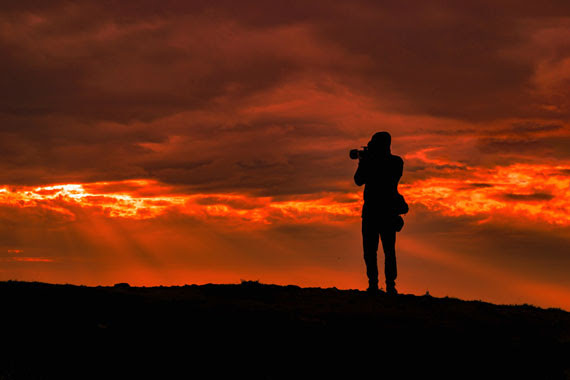
Photography is often celebrated for its ability to capture moments, tell stories, and create art. However, beneath the layers of technique and vision, there is an array of health benefits that many practitioners may not be fully aware of. Engaging in photography not only sharpens our visual acuity but also fosters well-being in various dimensions of our lives.
1. Mental Stimulation
Photography is a blend of creativity and technical skill. Every time you frame a shot, decide on settings, or edit a picture, you are making decisions that challenge and stimulate the brain. This mental exercise can help keep the mind sharp, potentially reducing the risk of cognitive decline as we age.
2. Mindfulness and Presence
The very act of looking through a viewfinder or display screen requires one to be in the moment. It encourages a mindfulness practice, as photographers must focus on the here and now. This state of presence can reduce stress and anxiety, offering a break from the fast-paced chaos of everyday life.
3. Physical Activity
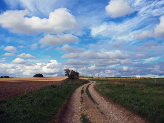
While it might not be the first thing that comes to mind, photography often involves a significant amount of physical activity. Whether you’re walking through a city looking for the perfect shot, hiking up a mountain for a breathtaking landscape, or simply standing and crouching repeatedly to get the right angle, you’re getting your body moving.
4. Social Connection
Photography can be a bridge to meeting new people and forging connections. Whether it’s attending a workshop, joining a photography club, or interacting with subjects, the art creates numerous opportunities for social interaction, which is crucial for emotional health.
5. Boosted Self-Esteem
Mastering a new skill or getting recognition for a great photo can do wonders for one’s self-esteem. As photographers see their skills improve over time, or receive positive feedback, it instills a sense of accomplishment and boosts confidence.
6. Therapeutic Expression
Photography can serve as a therapeutic outlet for expressing and processing emotions. It allows individuals to convey feelings, thoughts, and narratives that might be challenging to articulate verbally. For many, it becomes a form of visual journaling, helping to process complex emotions and experiences.
7. Enhanced Observation Skills
Regularly practicing photography trains the eye to see details that might otherwise go unnoticed. This heightened sense of observation can translate into everyday life, making one more attuned to their surroundings and more appreciative of small wonders.
8. A Sense of Purpose
For some, photography offers a renewed sense of purpose, especially if they’re working on a project or aiming to convey a particular message. This motivation can provide direction and structure, often alleviating feelings of aimlessness or depression.
9. Connection with Nature
Many photographers are drawn to the great outdoors. Nature photography not only provides stunning subject matter but also exposes the photographer to fresh air, sunlight, and the therapeutic sounds of nature, all of which have proven health benefits.
Photography is more than just a hobby or profession—it’s a pathway to better health. As with any activity, the key is to enjoy the process, be patient with oneself, and stay curious. Whether you’re a seasoned professional or just starting, the act of capturing the world through a lens offers myriad benefits that enrich both the mind and body. So, pick up that camera, and let the journey to well-being begin!